Africa Go Green Fund

Summary

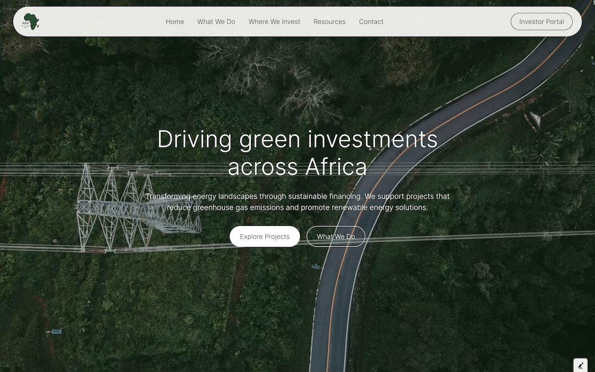
A modern, minimalist website redesign for a fund financing sustainable energy projects that cut emissions and promote renewable energy across Africa. The redesign improves how visitors browse portfolio projects, with a map of Africa and simple navigation that keeps the focus on the fund's impact.

Services

Web Design, Web Development

Industry

Finance

The bitter taste

Atlas came to us with a problem. Their old site was heavy. Slow. It felt like a chain coffee shop. It hid the very thing that made them special. The story was buried under stock photos and clutter. Customers could not find the beans. They could not feel the altitude. The brand was lost in the noise. They were selling an experience but the digital door was closed. We had to tear it down to the studs. The challenge was not just to build a website. It was to build a window into the Colombian highlands. A place where a man shakes your hand and knows your name.

The clean cup

We started by stripping away the noise. Every element that did not serve the bean was cut. The new architecture is simple. A single scroll tells the whole story. We built a roasting guide that feels like a conversation with the farmer. The product pages breathe with white space. A man can find his single-origin in two clicks. The typography is sturdy, like the hands that pick the cherries. We used a restrained palette pulled from the Colombian soil. Deep greens. Raw earth. The photography leads every page. We built a custom order flow that mimics the care of a barista. No clutter. No confusion. Just the coffee and the climb. The site loads fast on a phone in the mountains. That matters. A good website, like a good cup, should leave nothing but the truth behind.

Have a project in mind? Let's talk.

Thanks for reaching out! I've got your message and will reply shortly.
Something went wrong sending that. Please try again.